« Data profiling- a search or a code to crack? | Which myths are holding you back? »
Preparing Data for QlikView
 In this blog post, I am going to play with some economic data- specifically, Canadian Import and Export data using Datamartist and then use QlikView Business Intelligence Software to analyze the results.
The trick with public data like this is that often (ok almost ALWAYS) either data is missing, or the codes don’t match up. In this case, the country descriptions from various data sets I want to use don’t match- and different data sets have different holes (i.e. not all datasets include data for all countries). Finally, some data sets have a different definition of a country- for example, they break out places like “British Indian Ocean Territories” that need to get rolled up in the UK numbers.
Country statistics data such as GDP, GNI and Population were also incorporated to provide dimensions to carry the analysis out on. The raw trade data was obtained from Industry Canada’s “Trade Data Online” (http://www.ic.gc.ca/sc_mrkti/tdst/tdo/tdo.php?lang=30&productType=HS6). The World Bank was the source of the country statistics data (http://data.worldbank.org/indicator). A zip file containing the raw data, as well as the Datamartist data transformation .dmc file is provided at the bottom of this post.
I started by transforming the country statistics data. The raw data included information on GDP, GNI, Total Population and Urban Population. A screenshot of the Datamartist canvas for the first portion of this data transformation is provided below.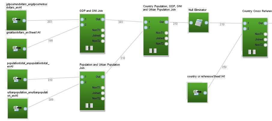 As seen above, the first step in the data transformation involved importing the four excel data files. During this import, columns with data not relevant to the year 2009 were filtered out and zeros were inserted into any null data rows, signifying that data for that row was not available.
 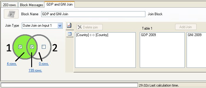 A series of data “Join” functions were then carried out to create one data file containing all of the country statistics information. Upon completion of joining these data files,” a “Calculation” block was utilized to replace any null data values resulting from the data join with zero’s. Finally, the country statistics information was joined with a country cross reference list. Basically, this join standardizes all of the country names.
The second part of the country statistics data transformation focused on segmenting the data, as shown in the Datamartist canvas screenshot below.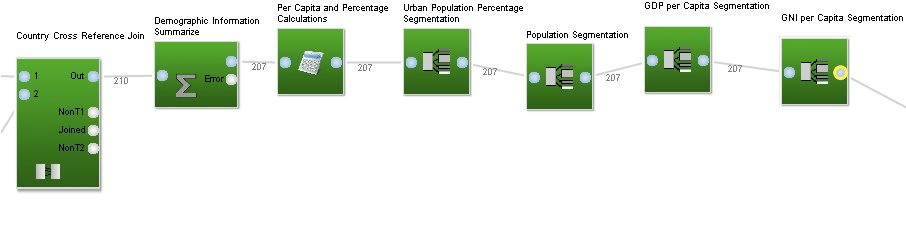 Before the data could be segmented, it was summarized so that there was only one data row for each standardized country name. A “Calculation” block was then added to calculate the GDP per Capita, GNI per Capita and Urban Population Percentage using the Population data. With these calculations complete, a series of “Segment” blocks were added to the canvas. The “Segment” blocks are extremely useful because they add an additional column to the data set which is
  populated according to a set of segmentation rules defined by the user. In this example, the “Segment” block was used to segment the GDP per Capita, GNI per Capita, Urban Population Percentage and Population data. The segmentation rules for the Population “Segment” block are shown in the screenshot on the left.
A similar set of data transformations was also carried out on the Canadian Import and Export Trade data.  As seen in the Datamartist canvas screenshot, the Canadian Import and Export Trade data was imported, joined and null data values were replaced with zeros. The country names were then standardized and summarized so that the Canadian Import and Export Trade data could be joined with the Country Statistics data.
With all of the raw data transformed into a suitable format, a final set of data transformations were carried out to create a single text file. This text file was then exported so that QlikView could be used to analyze the data. A screenshot of the Datamartist canvas for this final set of data transformations is shown below.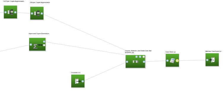 In this final set of data transformations, the “Star Schema” block was used first. The “Star Schema” block is a handy data transformation tool because it allows numerous data join operations to be carried out simultaneously.
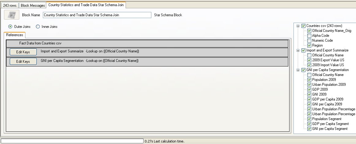 It was used to combine the Country Statistics data and Canadian Import and Export Trade data with data defining a country’s geographical region. A screenshot of the “Star Schema” block configuration window is shown to the left. The joined data was then put through a “Calculation” block one last time to eliminate any null data values. Finally, the transformed data was exported as a text file so that it could be analyzed in QlikView.
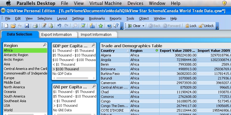
The transformed data was then imported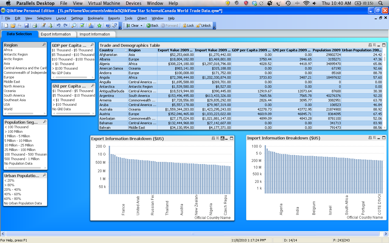 into QlikView and a dashboard was created to analyze the data with. QlikView is a great data analysis tool because it allows data to be filtered and visualized very efficiently. In this example, I made a dashboard that allows Canada Import and Export Trade data to be visualized using the Country Statistics Data segments created using the Datamartist software as filters. A screenshot of the dashboard with no filters applied is shown to the right. I am now going to show a series of screenshots with different data filters applied. To start off, I want to see the countries that Canada Exports the most goods to. To do this, I just dragged a box over the largest bars on the export graph as seen below.
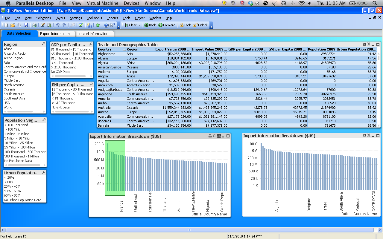 Once I finished making the data selection box on the graph, I released the mouse and QlikView automatically zoomed in on the area I selected. In addition, the upper right table in the dashboard updates as well. The image below shows the results. As seen in the image, Canada’s biggest export trade partners in 2009 were the United States, the United Kingdom and China.
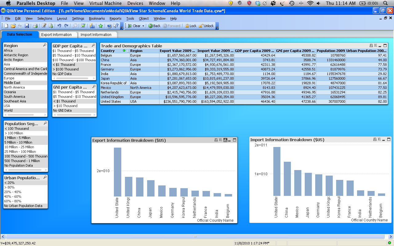 As a second example, I will filter the data using the data segments created in Datamartist. If I click on “Asia” in the “Region” box then only data from the countries in Asia is shown in the table and graphs. Furthermore, the segments in the other filter boxes (GDP per Capita, GNI per Capita, etc) updates to the region selection as well. It does this by highlighting the data filter segments that are valid for the “Asia” region in white. For example, in the “GDP per Capita” box, all data segments are valid except for the “GDP > $100 Thousand” segment. A screenshot of QlikView with the “Asia” region filter on is shown below.
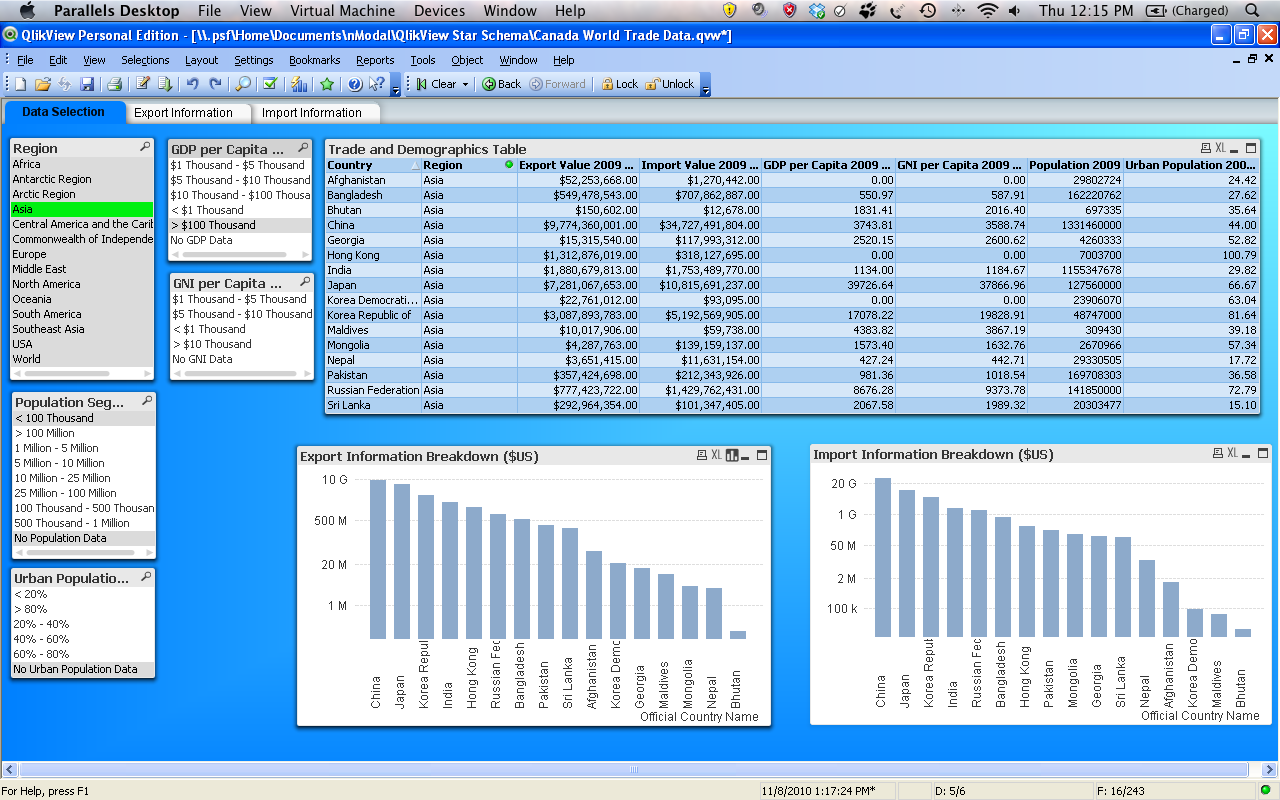 I can further filter the data by clicking on any other data filter segments that are white. As an example, if I select “$1 Thousand – $5 Thousand” in the “GDP per Capita” box and “40% – 60%” in the “Urban Population Percentage” box, the graphs and table update again. In this instance, the only countries that meet these filter requirements are China, Georgia and Mongolia. A QlikView screenshot with all three of the filters chosen is shown below.
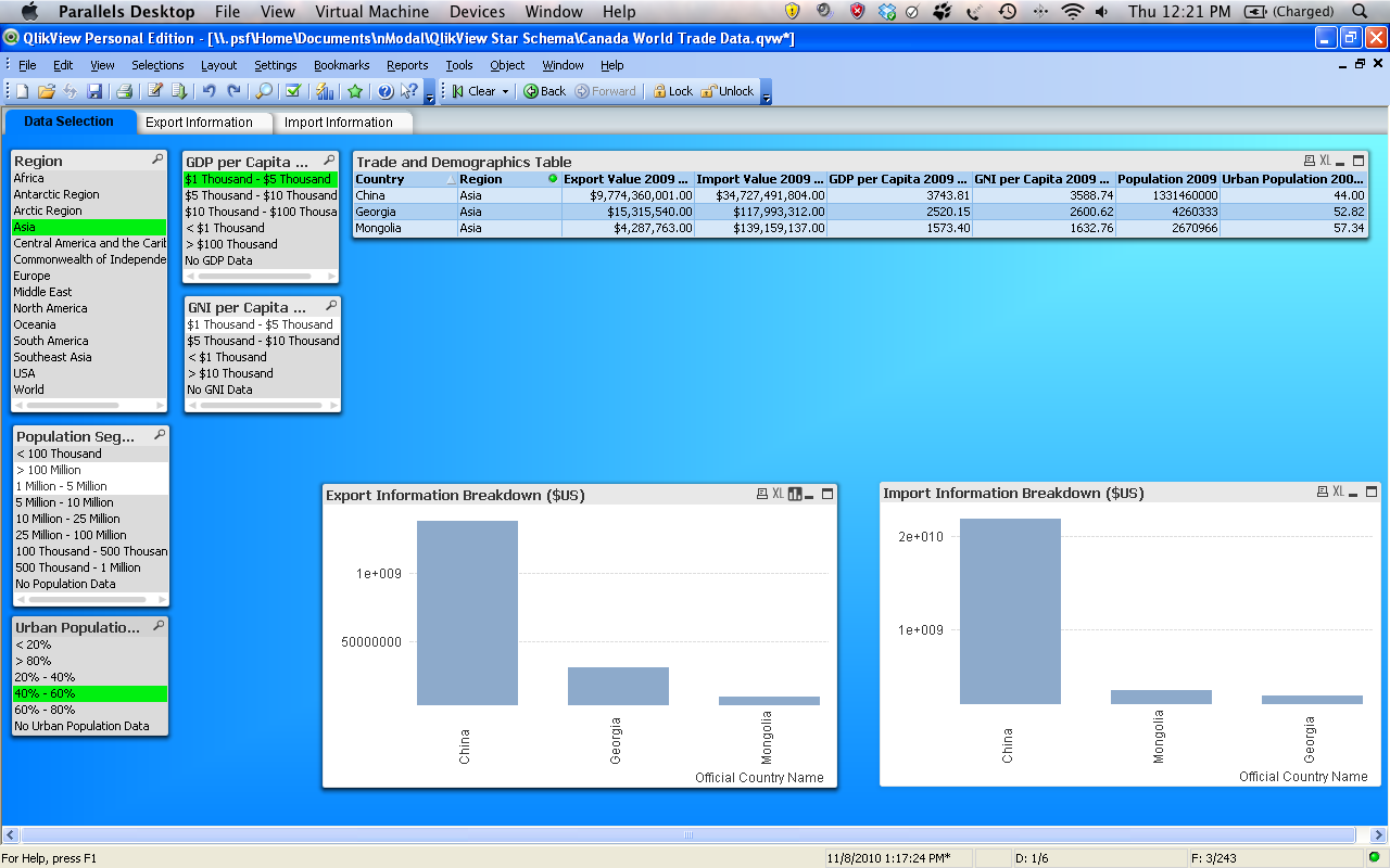
Try it out yourself with the free trial
You can give Datamartist a try with this data, just signup and download the free trial, and then download a zip file will all the data, and the example Datamartist file.
Just extract all the files in the above ZIP file into the “My Datamartist” folder that the Datamartist trial will create when you run it, and open the “World Trading Example.DMC” file with Datamartist.
You’ll find that Datamartist gives you a powerful, visual way to transform data from lots of places, and get it ready for great visualization tools like Qlikview in a step by step, clean, repeatable way.
On top of that, datamartist can be automated- so if you have data transformations you need to run on a schedule, you can design them in a graphical environment, test them, and then have them run automatically.

« Data profiling- a search or a code to crack? | Which myths are holding you back? »