« Datamartist Beta Presented in Toronto | Data Warehouse vs Data Mart »
Data Profiling and Data Completeness
There are various steps in data analysis- for me the very first one is always “what have we got?”. You have a data set, and some broad requests or ideas about what you want to get out of it, but the first question is how good is the data? In the end, the first thing I always do with a data set is to profile it. Explore it a bit, try to figure out if I’m good to go, or if I have some serious data quality issues that have to get fixed up first.
UPDATE: The data profiling capabilities of the Datamartist tool have continued to evolve- with even more on the way. Download the free trial and discover what you can learn instantly about your data.
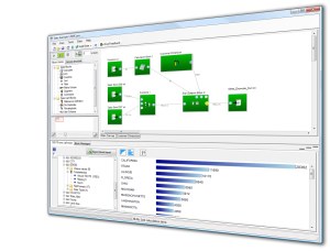
The simple row count I’ve started with gives you a clear, vertical bar chart that shows the row count for each unique value for each column. Nothing fancy, just the facts. But its extremely useful. It immediately let’s you see if you have issues with Null values, it shows you if the distribution of values has a long tail, or is more evenly, or randomly distributed. And it even serves as a basic duplicate detection, since often sorted views with counts will reveal issues in categories.
But its only the beginning. Data profiling can give amazing views into even very large data sets by using visualisation techniques.
My goal is to bring forward a visibility into data that allows analysts to quickly know where the issues are, where the solutions might lie, and in the extreme cases, to know that a data set is “junk” and wave off before wasting time on analysis.
Send me your ideas for data profiling reports/visualisations- the first step to great data analysis is accessing the data.
« Datamartist Beta Presented in Toronto | Data Warehouse vs Data Mart »


