« Preparing Data for Tableau (part 1) | Data profiling- a search or a code to crack? »
Transforming Data for Tableau (part 2)
 In this second part of the blog post, I am going to discuss how I added data about electricity generation in the U.S.A. to the output data file discussed in part one of this blog post. As before, I will transform the data using the Datamartist software so that Tableau’s powerful visualization software can be used to share information about U.S. electricity generation.
Once again, the U.S. Energy Information Administration was the source of the data (http://www.eia.doe.gov/cneaf/electricity/esr/esr_sum.html, Table 10). This time, the data was provided as one Microsoft Excel spreadsheet giving detailed information about the thousands of electric power generation companies in the U.S.A. The raw Excel file from the website had some merged cells, and had column names in multiple rows, so we had to clean it up a bit before importing. This is often the case, when using files that are more reports than raw data.
Even after these formating fixes, as is often the case, the data in its original form is not what we need- due to the large size and slightly different formatting of this spreadsheet, it was necessary to transform the data before combining it with the electricity consumer data. A visual map of these data transformations is provided in the screen shot of the Datamartist canvas below.

As seen in the screen shot above, the first data transformation carried out was a data summarizing operation. In this operation, the input data was summarized by state and class of ownership, converting the 3200 row input data file into a data file containing only 170 rows of data.
The next data transformation step required the use of the “Join” function.  This is a very useful function in the Datamartist software because it allows two data files with different formatting to be joined together into one data file. In this instance, the summarized electricity generation data file was joined with a data file containing U.S.A. state abbreviations. This was done because the U.S.A. electricity generation input data file only contained state abbreviations. The result of this joining operation inserted a column containing the states full name based on the state abbreviation used in input data file.
With the join operation complete, the data was further transformed using the “Calculate” and “Sort” functions.  The “Calculate” function was used to remove the data column containing the state abbreviations, as the previous “Join” function had added a column with the states full name. The “Sort” function was then used to sort the electricity data by state and class of ownership.
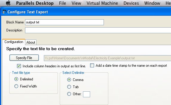
The data was then put through one last calculation function that renamed the column names, before being exported as a text file.
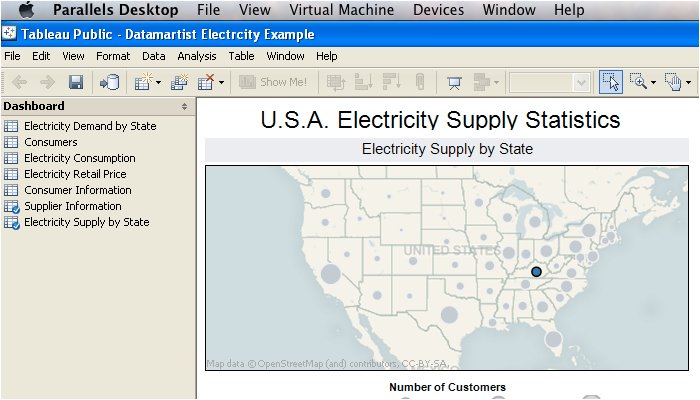
 Now that the electricity generation data has been transformed, the Tableau visualizations can be used to present the data. It is worthwhile noting that since I joined the electricity consumption data with the electricity generation data before exporting it from Datamartist, I only needed to import one data file into Tableau Public 5.2. This single data file contained all of the information required to create both the electricity consumption and generation visualizations. As with part one of this blog post, I have included a Tableau dashboard summarizing state level electricity generation statistics below. This visualization is very similar to the visualization in the first part of this blog post. You can try it for yourself by clicking a state on the map and watching the table below the map update to present data about that particular state.
See the Data Transform Yourself!!!
All of the data files used in the data transformations in part one and part two of this blog post, as well as the Datamartist .dmc file, can be downloaded in a ZIP file here. You can see the data transformations discussed in these blog posts for yourself by downloading the free trial, install Datamartist, and then put all the files in the above zip file to the “My Datamartist” folder that datamartist creates in your “Documents” folder. Then just open the “Electricity Example.dmc” file in Datamartist and check it out.

« Preparing Data for Tableau (part 1) | Data profiling- a search or a code to crack? »