
« Good Data is a force for good. | Transforming Data for Tableau (part 2) »
Preparing Data for Tableau (part 1)
 This is a two part blog post about sharing data information using Tableau Public 5.2 visualization software which is a fantastic way to share data visualizations over the web. It’s easy to use, free, and allows users to share information by creating great interactive visualizations.
The first challenge of creating great visualizations is getting the data that you want to present in the format that you need. Often, it’s not all in one place, and some combining and transforming is necessary.
In this example, I am going show how I got data about consumer electricity usage in the U.S.A. from the U.S. Energy Information Administration and reorganized it so that I could share it using Tableau’s software.
To start off, I had to download three separate Microsoft Excel spreadsheets from the EIA website representing electricity consumption in the commercial, industrial and residential sectors. If I had a lot of time on my hands, then I simply could have spent an afternoon copying, pasting, sorting and calculating in Excel.
The problem is, if I made a careless error somewhere I’d have start all over again. Instead, I’ll show you how I did it with the Datamartist tool.
Datamartist has built in data transformation functions (i.e. combine, join, sort, calculate). These functions allow users to transform data without the need to scroll through thousands of rows of data. Additionally, the data transformations carried out can be repeated if the input data changes!
With the data downloaded and Datamartist software running, I started the process of turning three Excel spreadsheets into one useful data file summarizing electricity usage. As seen in the annotated screen shot below, the Datamartist data transformation process is visual, with input data and data transformation operations being represented as blocks on a canvas. These blocks are then connected together, defining the order in which data transformation operations occur.

The first step in transforming the data was to apply a filter to each of the spreadsheets. This filter removed any information which wasn’t provided at the state level. With all of the incoming data filtered, I used the “combine” tool in Datamartist to combine the three data files into one. The data was then sorted according to the state and type of consumer (commercial, industrial or residential) that it represented.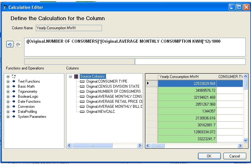 A calculation was performed using the available data to determine the annual electricity consumption by state (see picture below). Finally, I joined the electricity consumer data with data about electricity suppliers before exporting the data as a text file to be analyzed using Tableau. I’ll go into more details about the “joining” operation, as well as what I did with the electricity supply data in the second part of this blog post.
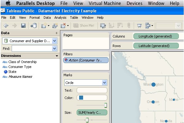
Now that the electricity consumer data has been transformed, the powerful visualization tools in Tableau Public 5.2 can be utilized. I started by importing the electricity consumer data file into Tableau. Once the data is imported, Tableau automatically sorts the data columns into “Dimensions” and “Measures,” depending on whether the data in each column is a text string or a number. One of Tableau’s great features is that it generates the latitude and longitude of geographical locations recognized in the “Dimensions” columns. I decided to utilize this useful feature to display data about electricity consumption for each state. To do this, I dragged the latitude and longitude “measures” to the rows and columns area on the Tableau worksheet (see screen shot below). 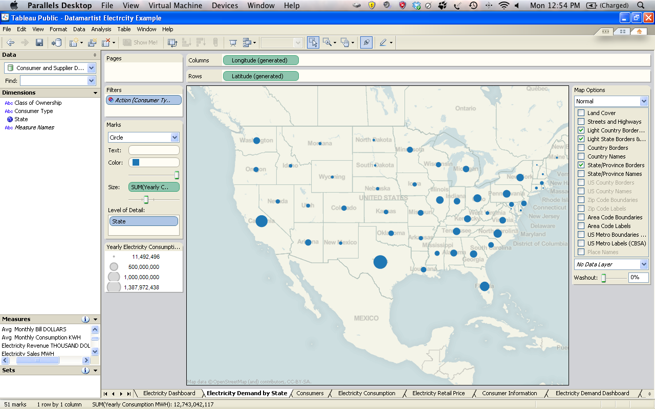 This generates a map of the geographical locations on which additional data can be displayed. I then created a “Dashboard” which displays a map of the U.S.A. with the total electricity demand of each state superimposed on the map, as well as a table summarizing important electricity usage statistics. A link exists between the map and the table that updates the information displayed in the table based on the geographic location selected on the map. You can try using the Dashboard that I created yourself by clicking on a state on the map below and watching the information in the table update!
Anyways, that’s all for part one of this blog post. In part two, I will discuss how I transformed data about electricity suppliers in the U.S.A. and share the data using Tableau visualizations again.

« Good Data is a force for good. | Transforming Data for Tableau (part 2) »
Can you please point to the original files that you downloaded, or a more detailed description on how to get to them? I cannot find them based on your description.
no problem. I forgot how unintuitive the EIA site is to navigate.
http://www.eia.doe.gov/cneaf/electricity/esr/table5.html